Every year I enjoy attending Ealing Beer Festival, as it's the easily the best of the main London beer festivals. They always put together a great beer list and it's lovely to sit in a lush, green park on a warm summer's day and work your way through that list (well, 1-2% of it anyway).
This year, you'll find this great beer festival taking place in Walpole Park, Ealing from the 8th of July (Wednesday) to the 11th (Saturday).
As is becoming a tradition, I've perused the beer list in advance and come up with my top picks - represented in the form of an imperfect and completely unscientific Euler diagram.
I wrote about how I come up with my choices and why I ended up using Euler diagrams in my blog post about Ealing Beer Festival 2014, so I won't go into too much detail this time.
Brief explanation
To cut down on time spent reading descriptions, when I could instead be enjoying the beer, the outdoors, the company and conversation, I like to go to Ealing with some idea of what I want to try out. It's also useful to spend a little bit of time preparing because people often ask me which beers they should try, and liking most types of beer, I find this quite a difficult to answer in an ad-hoc manner.
I used to prepare a list, but I found that it was too slow to read (on the day) and that I wanted something more succinct, while still containing the core details that I "need":
- Beer and brewery names (so that I can locate them)
- Safe bets vs. adventurous choices
- The type of beer (light / dark / hoppy / malty)
- The ABV (%)
The solution I came up with was to plot beers on a Euler diagram with three sets "Light / Hoppy", "Bitter" and "Dark / Malty / Stouts".
It's not scientific or even necessarily correct (I haven't tried a lot of the beers, so a lot of it is approximation based on the description), but it serves a purpose and seems to work fairly well. To separate my fairly confident recommendations from those I'm less sure about, there's line through the middle of the diagram.
The main thing I like about this idea is that it's easy to switch between the different styles of beer depending on what takes your fancy, or if you only really like one of these quadrants then it's easy to find similar beers.
This year's diagram
Here is my Ealing Beer Festival 2015 diagram (click for full-size):
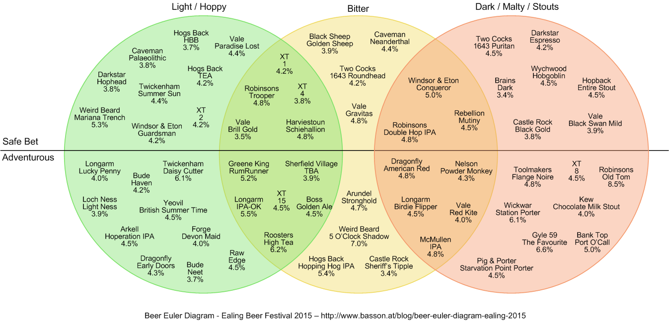
It's a bit more densely populated than last year's diagram, so there's plenty of options for anyone.
If you're planning on going to Ealing Beer Festival this year, I hope you enjoy it! If you take a print-out of this diagram, please let me know how you get on!